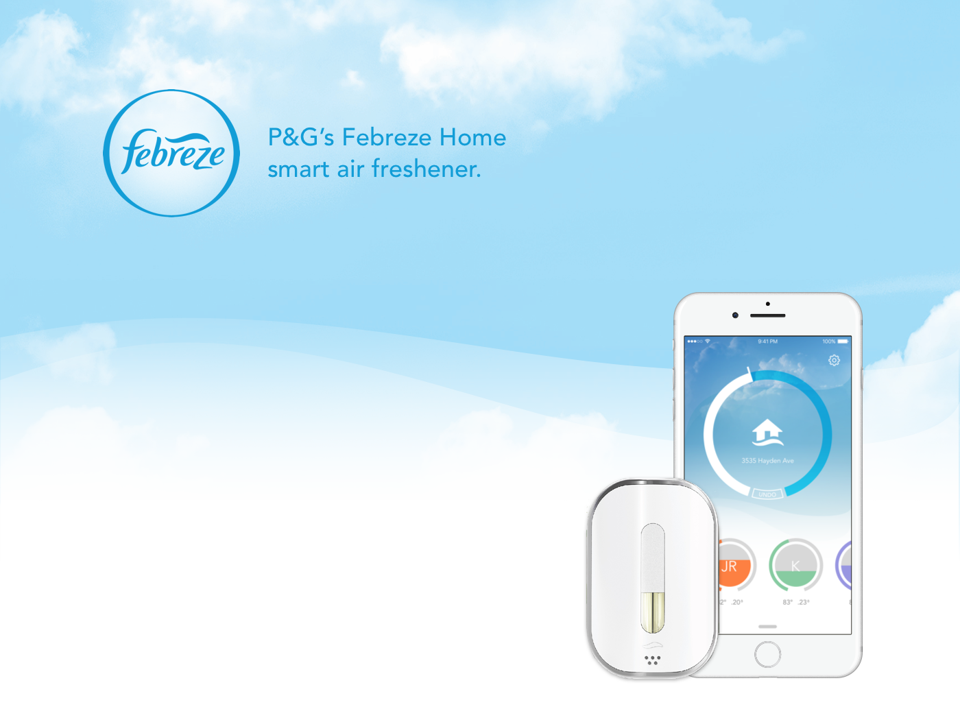

A companion mobile app for Procter & Gamble’s smart connected air freshener.
Febreze Home is a smart, connected air freshener equipped with heat, motion, and humidity sensors. When paired with the companion app, the Febreze Home offers users greater control over scent levels. The product is connected with Nest, a smart thermostat, as part of the Internet of Things ecosystem.
Procter & Gamble worked to with Creable and Intrepid Pursuits to carry out research, design and development for the application.

Key Roles:
My teammate Kathy and I collaborated with engineers, PM, product strategist and the designers at Creable to design the user experience and the interface that embodies Febreze visual branding identity. Some of the key parts I worked on were:
- Defined the core user journey and main functions for version 1, as well as product roadmap for the future.
- Structured the information architecture and golden user flow.
- Collaborated with Intrepid's product strategist to test our prototypes with external participants.
- Prototyped hi-fidelity interaction and motion design and worked closely with engineers to understand technological constraints.
Outcome:
After 8 weeks, we developed a functional v.1 iOS app including all the core functions, with Android version under the way. The Febreze Home device & application were previewed at the Consumer Electronics Show (Las Vegas, United States) in January 2016.
Fortune: P&G's Sci-Fi Air Freshener Makes Your House Smell Smart
PC Mag: The Smartest Connected Home Products at CES 2016.

Process
0. Challenge
Procter & Gamble knew that home automation was important to their various product lines, and was looking for the right opportunity to introduce a home automation product that was easy to use and provided great value.
Additionally, they saw an opportunity to fix a problem that some consumers had reported with their air freshener products: Depending on the temperature and humidity of a room, scents could linger too long, or not be strong enough. Further, some consumers wanted a more powerful scent, but controls for their current scent dispersal devices were not very fine-tuned. Finally, consumers who were away from home often would not bother to turn their devices off.
1. Design Sprint
In one week, Intrepid worked closely with Procter & Gamble to brainstorm and determine the app’s core concept and functionality. We did a lot of discussing, white-boarding, rapid prototyping and testing out different ideas.
Since this was my first design sprint, I learned a lot about different brainstorming methods, including asking open-ended How Might We questions and creating affinity map. Lots of ideas were generated and voted on (this was when we coined the term Noseblind to describe the scent level in the room – despite not going through, we still referred to it afterwards!)
At the end of the week, we arrived at one main direction to push the project further.
2. App flow, Wireframes & User Testing
The goal of this process was to create an experience that was simple to understand, while allowing the user to feel like they have a fine-grained control over all functions of their device. Picking up from our week-long sprint, we identified the core user journey, as well as the delight and pain points throughout the flow. We sketched out scenarios and context in which the users would use the app to design the interactions accordingly.
During the process, Kathy and I kept close communication with the iOS/Android engineers in the team to consider the technological requirements and constraints of each platform in setting up an IoT device.


At this stage, I made a low-fidelity prototype for our wireframes, then carried out internal and external user testing together with our product strategist. The testing goal was to see if the underlying interactions work for the users. One change we made after the testing was how the rooms were displayed on the Home Level page, which was changed from vertical scrolling to horizontal scrolling. This was to keep it structurally consistent with how the user browse the rooms at the Room Level.
3. User Interface & Visual Design
Collaborating with the design team at Creable, we developed key visual elements, new iconography and the overall look and feel that fit within the Febreze visual identity. Based on the original Febreze packaging design, we created unique looks for each scent choice to link the digital interface with its physical companion.
Since Creable team was in California and we were in Massachusetts, it was important for us to have daily check-ins to make sure both teams were on the same page. In addition to our video calls, we also frequently updated our progress on Slack and pinged each other for any questions. We learned to annotate our Sketch files in details before sending them over to Creable, as some of our design choices might not be obvious.
4. Animation & Motion Design
We prototyped the interaction and transition between each screen while working closely with developers to make sure that our design was feasible to implement.
Room to room transition
Home to room transition
An option for scent level animation