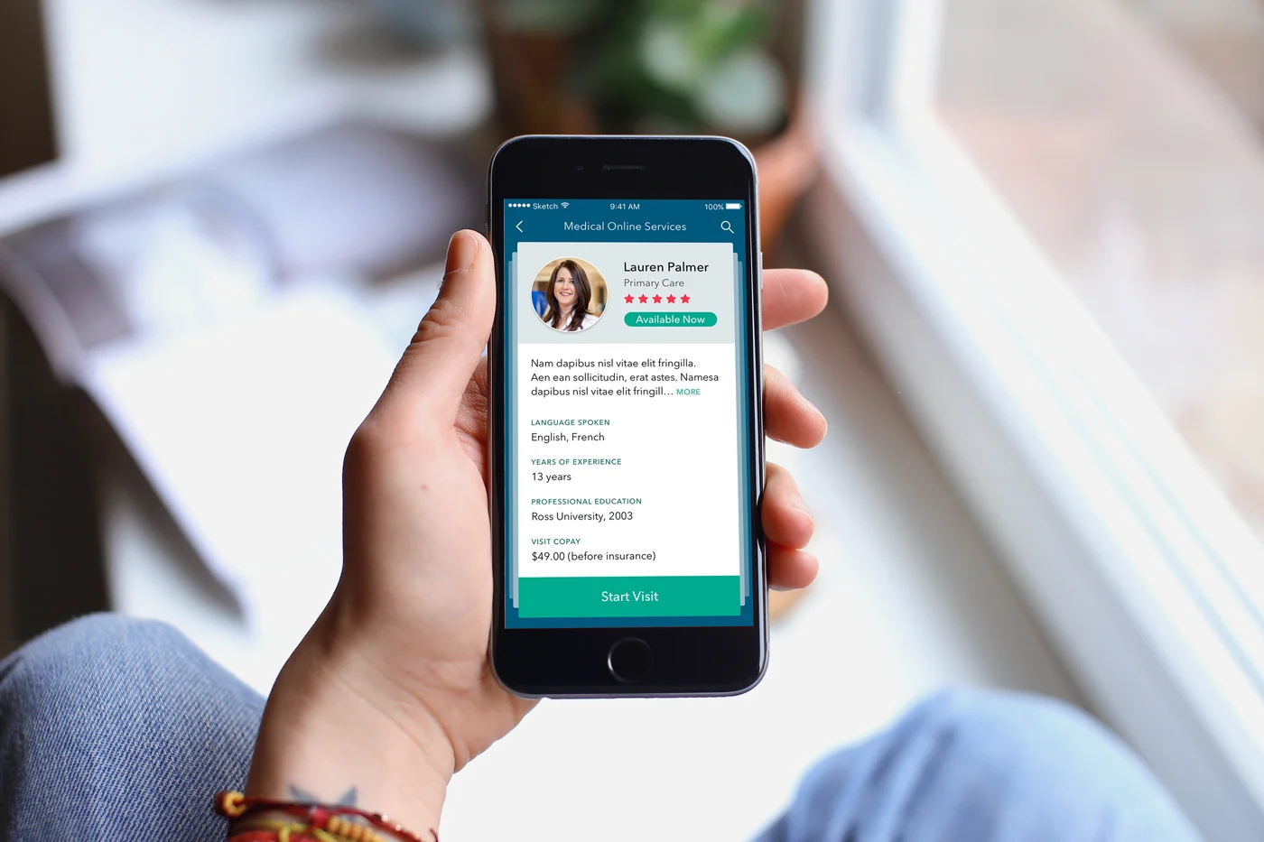
American Well / TEVA – Medical Application
UI/UX and Interaction Design Case Study
While at Intrepid, I had the opportunity to work with Akhil and Christine on the user experience and interface of a medical application for TEVA, a multinational pharmaceutical company.
Objectives
1. Interaction Design – Design the user experience (app flow, personas, user stories, wireframes) of Telehealth, a feature that allows patients to keep track of their medical records and browse available doctors to set up consulting video calls.
2. Visual design – Adapt TEVA's visual branding identity in the design of user interfaces across platforms (Android/iOS mobile and tablets)
3. Motion design – Animation and transition design
0. Initial App Flow (from Amwell)
1. Wireframing
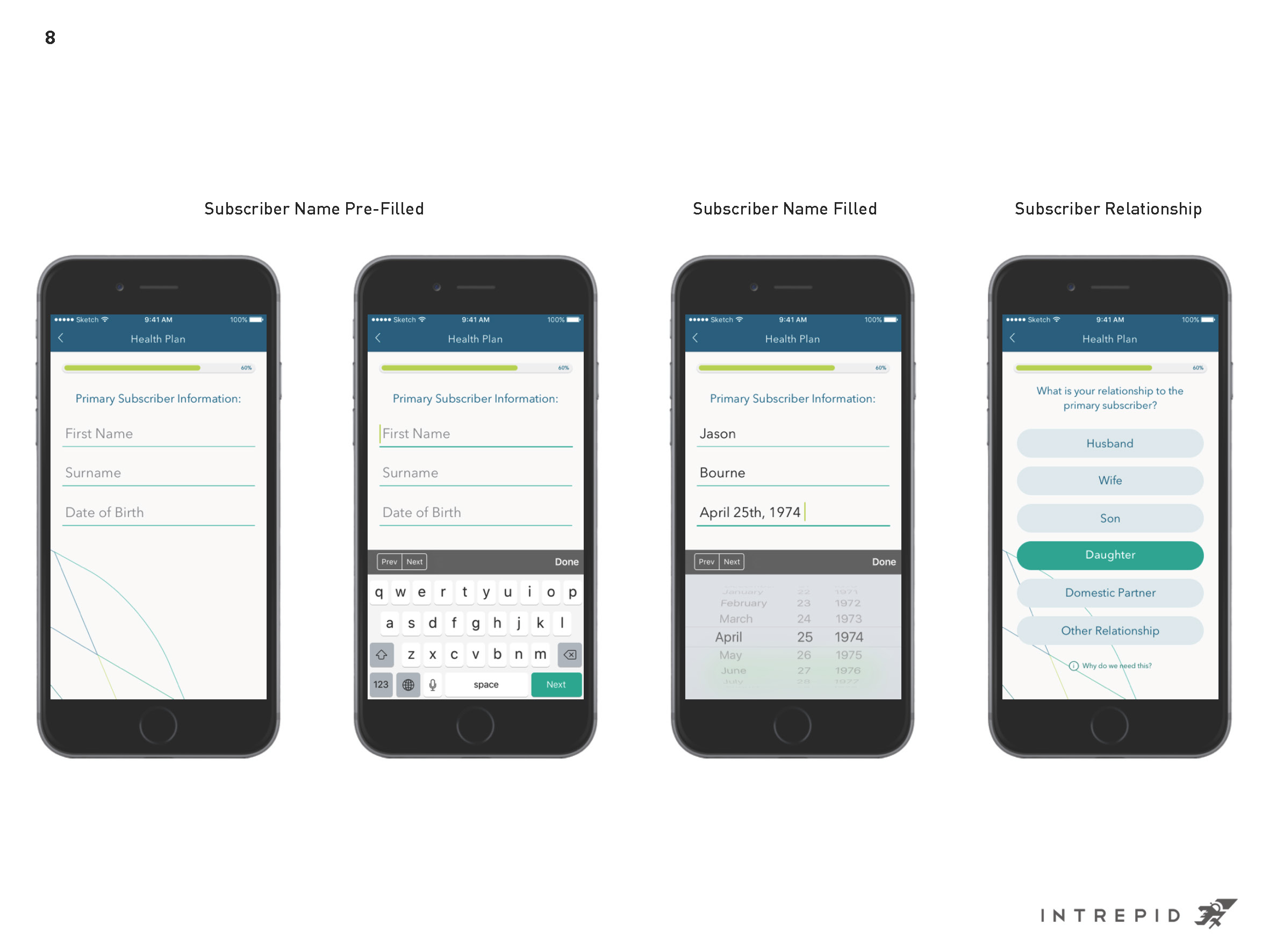
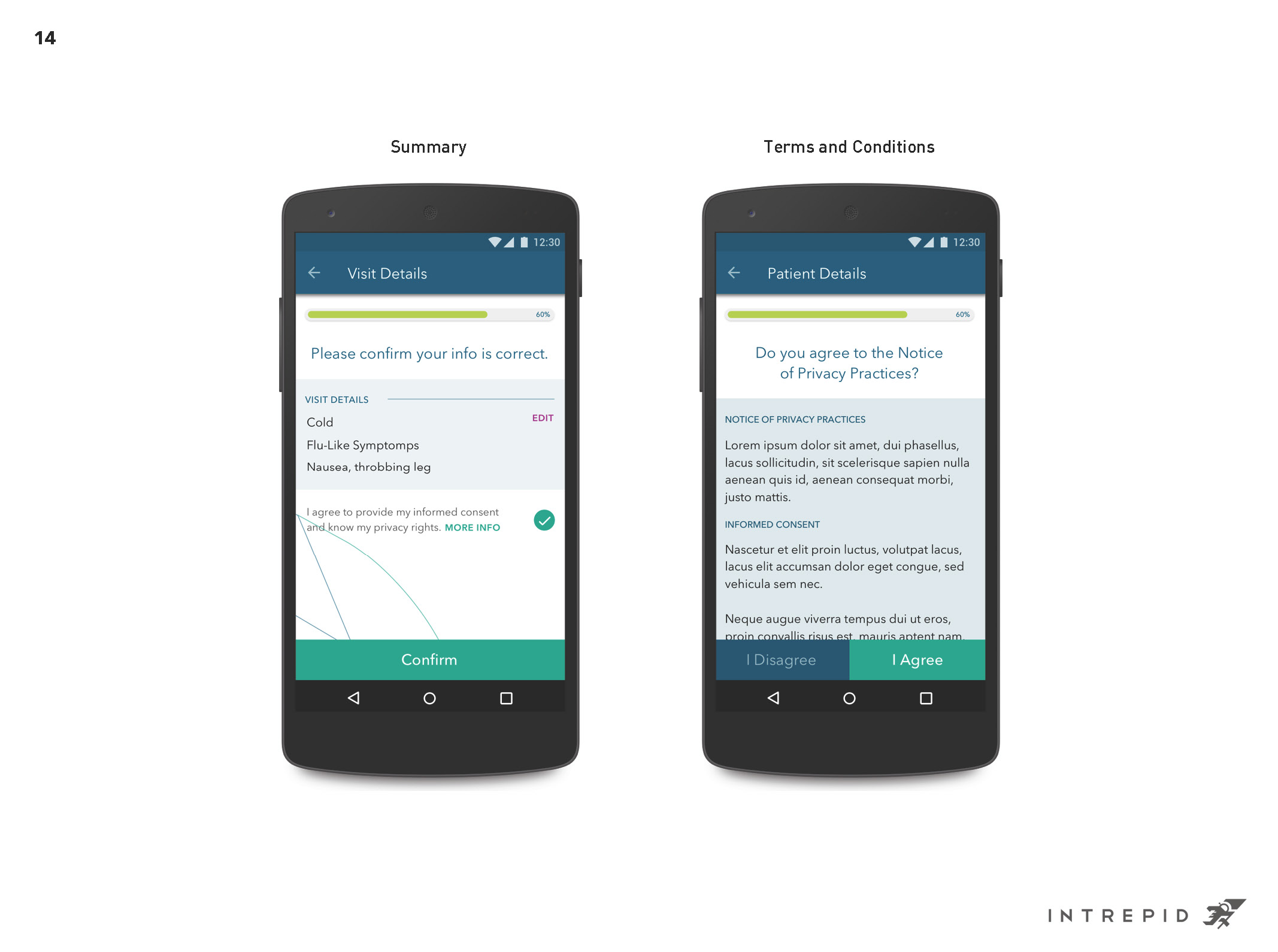
A few wireframe UX screens for the onboarding process.
In this flow, we imagined the highest probable number of steps a first-time user needs to go through when then start using the app. Since the app requires the user to log in details their medical records, the onboarding process can take a long time. We decided to break the process down into sections: some sections with lots of information deserve a whole screen, while other simpler inputs can be combined to shorten the flow. Additionally, we also decided to include a progress bar to let the user know how much left to be done.
2. Visual Design
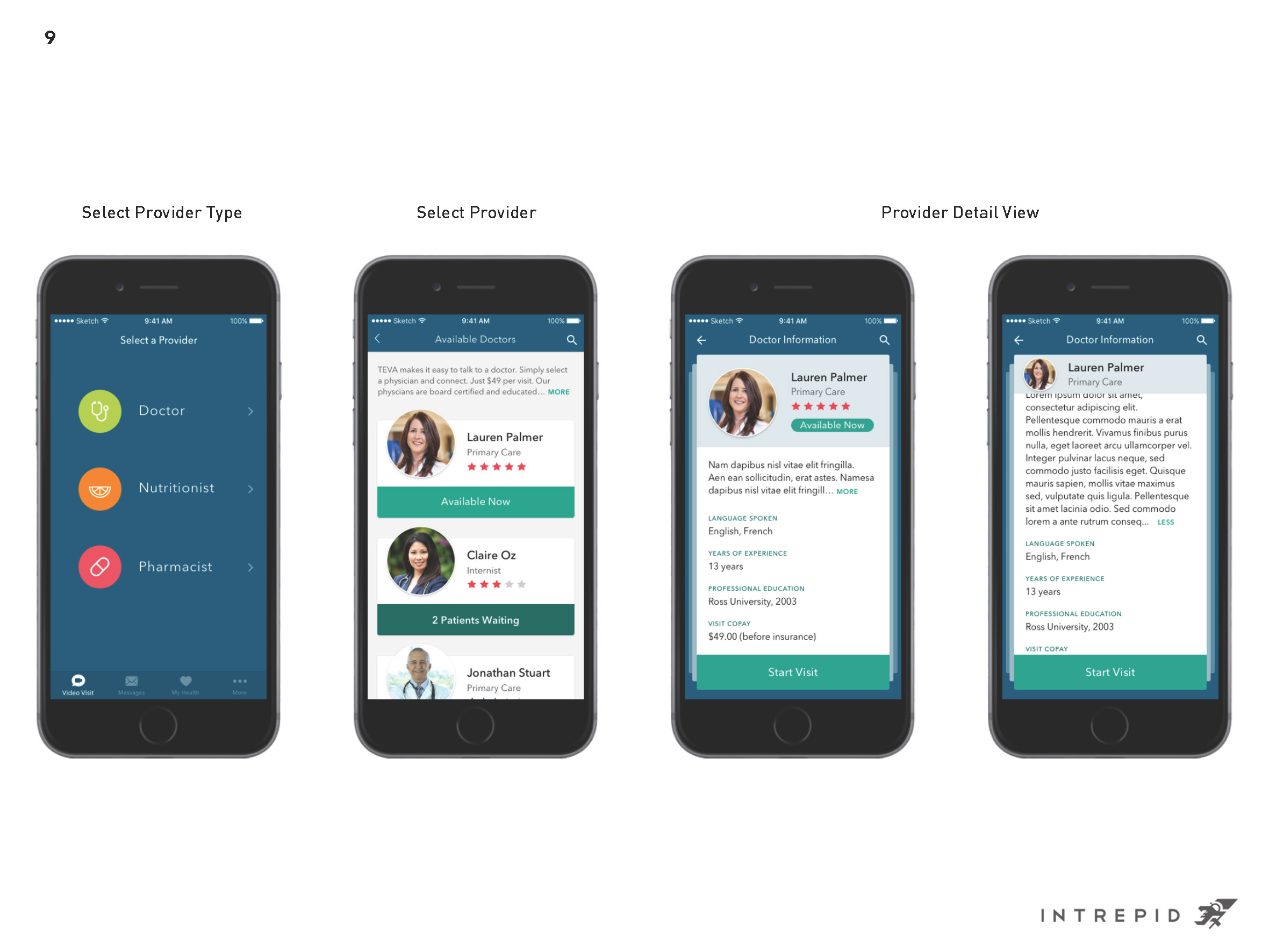
For a pharmaceutical company, TEVA has a strong visual identity with bright colors, clean typography, and a signature leaf imagery. As we designed the user interface for the app, we wanted to translate their brand into the digital experience. Below is one of our initial moodboards and look and feel design for the subscriber/provider flow.
Moodboard
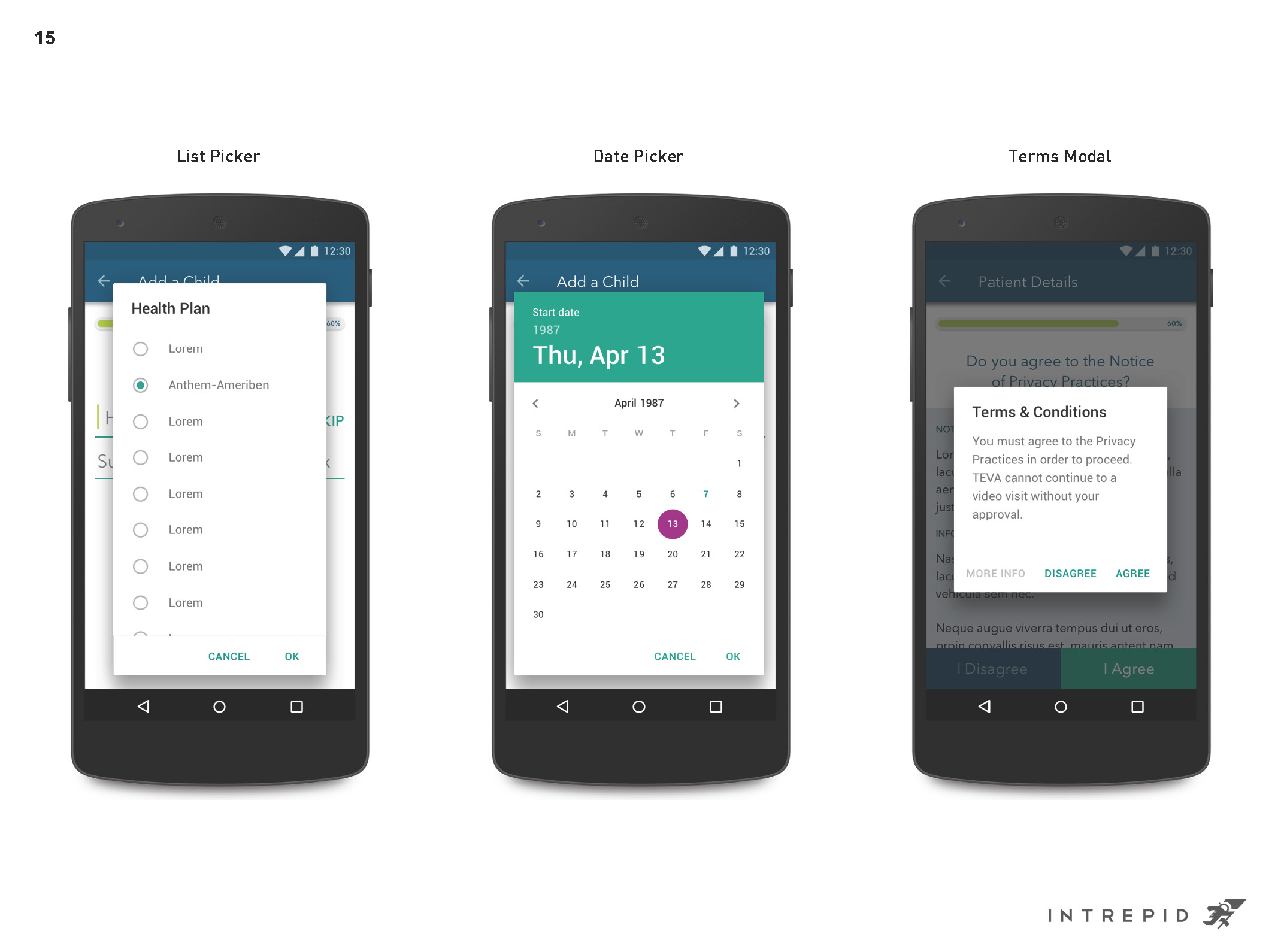
We went through a few iterations with TEVA, making changes based on their feedback and what we thought was best practice. Our final design, while still incorporate a lot of elements from TEVA visual branding, had a more serious tone that fit better with the medical nature of the application.
3. Motion Design
For animation and transition design, we decided to go with simple vertical and horizontal transitional motions/gestures, since many of our UI elements are lists and card views.
Extra – Symbols & Assets
This was a big project for us, we created over 1000 screens in total!
In order to make it work among three designers, we managed to create a system in Sketch (version mid-2016) using symbols and assets, so that we can organize our work and share files seamlessly with each other.
Master Sketch files symbol page organization
Styleguide
