DIN
This poster series is the culmination of a 4-part assignment:
- researching a given typeface and it's corresponding historical and cultural context,
- creating a 2D letterform combination typemark focusing on visual synthesis of form,
- building a 3D version of the typemark and photographing it, and finally
- designing three 16" x 16" posters which presented the research and images of the typemark. They are meant to work together as a series and individually.
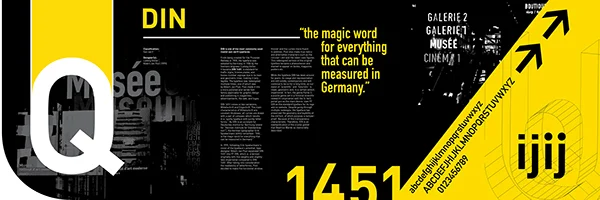
This is the spread of three combined 16" x 16" posters about the font DIN: its history, appearance and usage. The typemark is a combination of the letters U and Q. The colors of the spread is inspired by the fact that the typeface DIN was commonly used in signage, traffic signs, etc.
Advised by Lucinda Hitchcock for Typography II class in Spring 2013, Rhode Island School of Design.
16" x 48" Entire Spread
16" x 16" Individual Posters
DIN is one of the most commonly used realist san-serif typefaces. From being created for the Prussian Railway in 1905, the typeface was adopted by Germany in 1936 by the Siemens engineer Ludwig Goller. It became DIN 1451, a standard for traffic signs, license plates, and house-number signage due to its lean and geometric lines, making it very legible. The typeface was redesigned multiple times, one of which was by Albert≠Jan Pool. As DIN is an acronym for Deutsches Institut fur Normung (“German Institute for Standardization”), the German typographer Erik Spiekermann wittily remarked: “DIN… is the magic word for everything that can be measured in Germany.